Network Observability 1.5 is the new version of the operator from Red Hat that focuses on providing insights into networking. There's an upstream version that runs on plain Kubernetes, but this article will focus on using Red Hat OpenShift Container Platform (RHOCP) and the OpenShift web console for the user interface.
I will highlight the most important new features of this release, so if you want a summary of all the changes including bug fixes, check out the release notes. If you want some background of this product, read the OpenShift documentation and various Red Hat blogs on this topic, including my blog on the previous 1.4 release.
To get started, you should have an OpenShift cluster. You will need to log in with a cluster-admin role. Follow the documentation steps to install Network Observability provided by Red Hat in OperatorHub on the OpenShift web console.
Feature highlights
Version 1.5 has significant improvements in ease-of-use and a number of features related to graphs and metrics. The Flow Round Trip Time (RTT) feature that was in Technical Preview is now in General Availability (GA), which means it is fully supported.
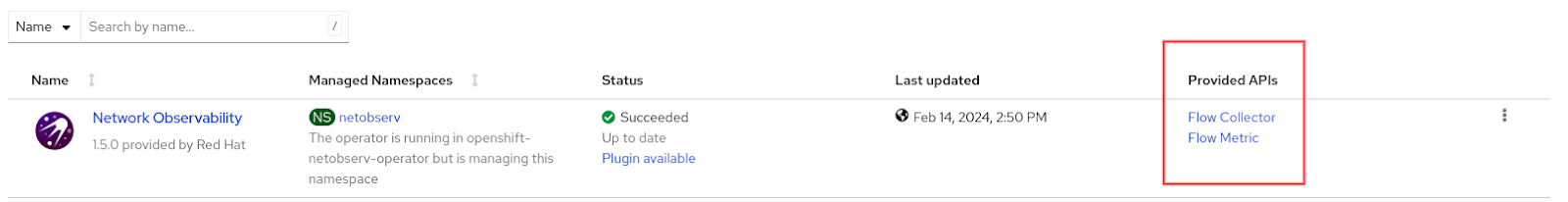
If you've used Network Observability before, the first thing you might have noticed after installing the operator is that there are two APIs available instead of one (Figure 1).
FlowMetrics is a development preview feature which I will cover at the end, so let's start with FlowCollector.
FlowCollector API
FlowCollector is the heart of network observability. Creating a FlowCollector instance deploys an eBPF agent for generating network flows, optionally supporting Kafka to improve scalability and reliability, a flowlogs pipeline for collecting, enriching, and storing the flow data and metrics, and a UI plugin for OpenShift web console to display graphs, tables, and topology.
In 1.5, the FlowCollector API version was upgraded to flows.netobserv.io/v1beta2 from v1beta1. In the web console, the UI or Flow view to create an instance gets a facelift. The custom resource has the following top-level categories:
- Name and Labels
- Loki client settings
- Console plugin configuration
- Namespace
- Deployment model
- Agent configuration
- Processor configuration
The first significant change is in Loki client settings. When you click and open this, you get the setting page shown in Figure 2.
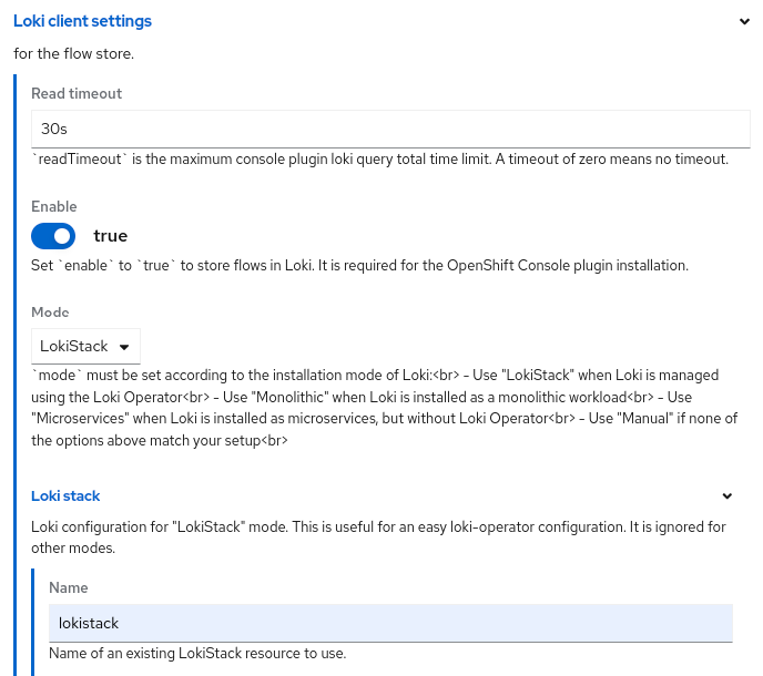
One of the new fields is Mode, where you select how you installed Loki. The most common is LokiStack, which means you installed the Loki Operator and created a LokiStack instance. Under the Loki stack section, make sure the Name matches the LokiStack name you gave it. The nice part is that it will go and figure out the LokiStack gateway URL for you and give it proper authorization.
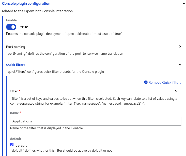
Parameters are now exposed under Console plugin configuration, particularly in Quick filters (Figure 3). Network Observability predefined some filters as defaults which can be changed. While this was possible before, now you can do it in the UI.
Under Agent configuration, there is no longer an agent type because the only supported agent is eBPF. It is still possible to configure IPFIX through YAML.
In Processor configuration, the changes are to enable availability zones, cluster ID, and a Metrics configuration section to select a list of predefined metrics under the Include list (Figure 4).
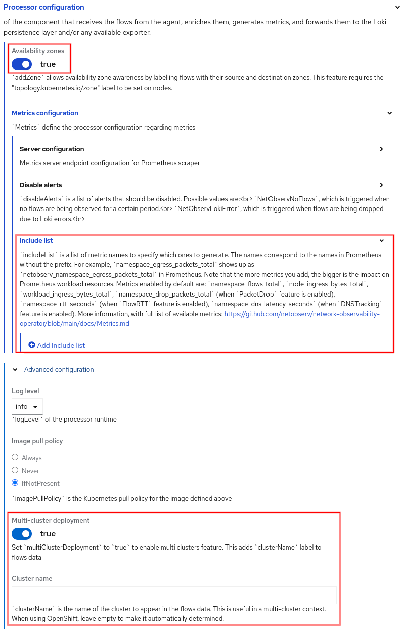
The full list of predefined metrics is here. When you include a metric, it stores it in Prometheus and is available as a Prometheus metric prefixed with netobserv_. For example, if you add the metric namespace_egress_bytes_total, then go to Observe > Metrics and enter the PromQL sum(rate(netobserv_namespace_egress_bytes_total[1m])). This should display a single line that is the sum of the average number of egress bytes over one-minute intervals. Select a refresh time in the upper right drop-down if you want the graph to be updated periodically.
Availability zones and cluster ID will be covered in the traffic flow table section below.
UI changes and features
In this section, we'll cover the new features and enhancements by going over the changes in the Network Observability UI, starting with the three tabs in Observe > Network Traffic, namely Overview, Network Traffic, and Topology.
Overview tab
Graphs for Flow RTT and Domain Name System (DNS) Tracking, including support for DNS TCP (previously only DNS UDP), were added. There are graphs for:
- Top 5 and/or top total graph
- Top 5 average graph using latest metrics or all metrics
- Top 5 max graph
- Top 5 90th percentile graph (P90)
- Top 5 99th percentile graph (P99)
- Bottom 5 min graph
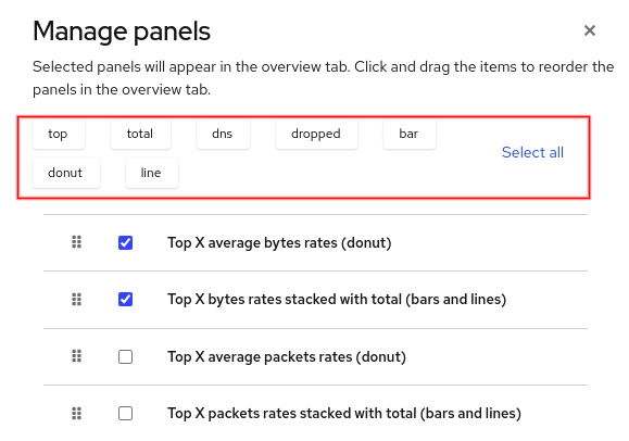
Manage panels selection
With so many graphs to choose from, the Manage panels dialog, found under Show advanced options, now provides a simple filter (Figure 5). Click one or more buttons to filter on the selection.
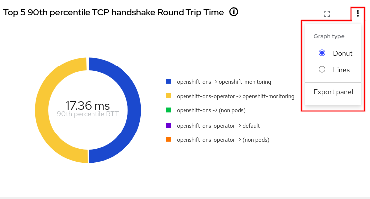
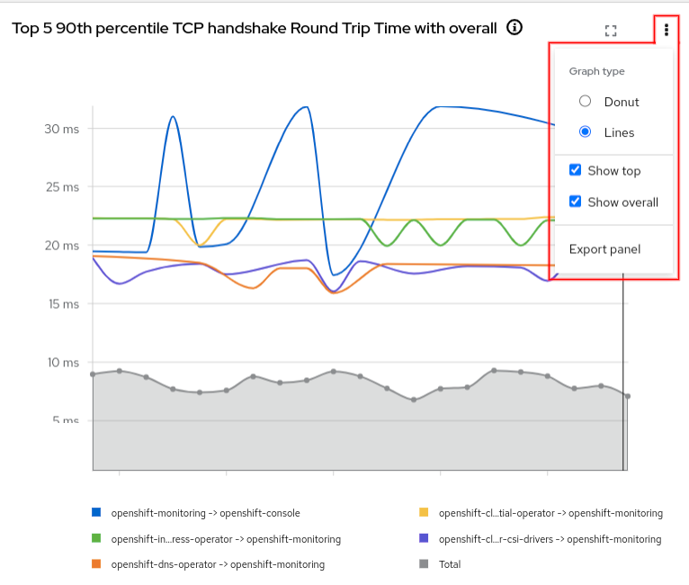
Graph types
If you click the three-dots menu (⋮) in the upper right corner of the graph, there will be various options depending on the type of graph. For example, the TCP handshake Round Trip Time graph shows a donut chart but can be changed to display a line graph (Figures 6 and 7).
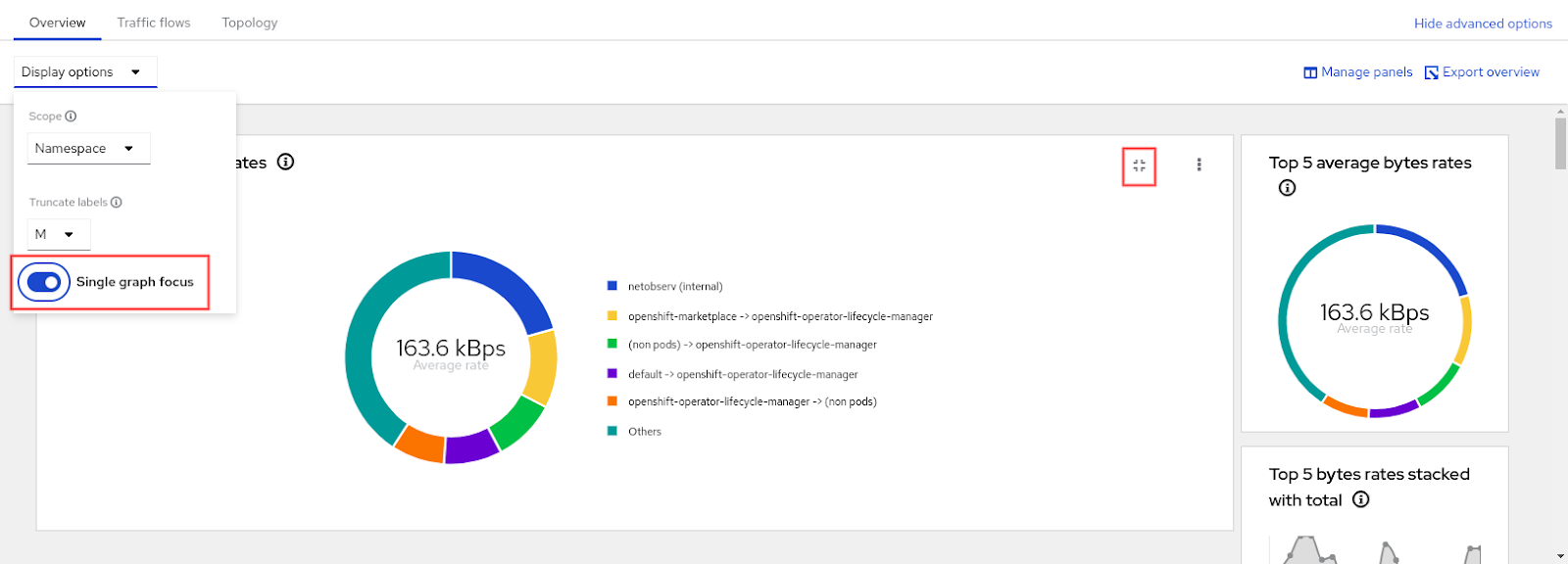
Single graph focus
All of the graphs are displayed on a scrollable panel. If you click the Focus icon in the upper right corner next to the three-dots menu (⋮), it displays one graph and gives a preview of all the other graphs on a scrollable panel on the right side (Figure 8). If you click a preview graph, it becomes the graph in focus. This feature can also be toggled in the Display options drop-down.
Traffic flows tab
These are the new labels in the flow data.
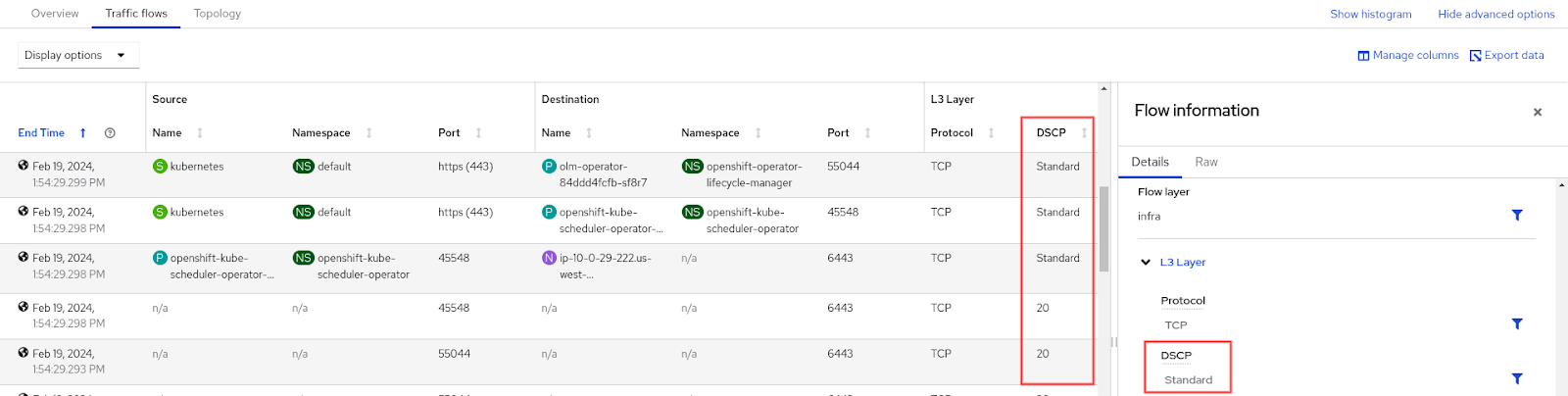
- Differentiated Services Code Point (DSCP): This is a 6-bit value in the IP packet header that indicates the priority of a packet to provide quality of service (QoS), particularly for time-sensitive data such as voice and video. The value "Standard" translates to 0 or best effort. In other words, the traffic is not getting any special treatment. See Figure 9.
- Column: DSCP
- Label:
Dscp
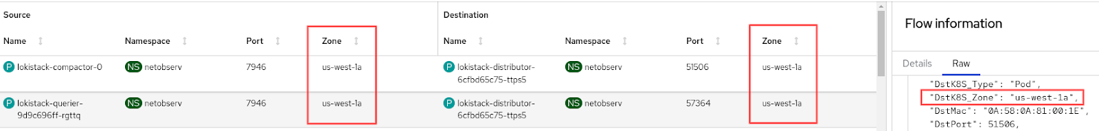
Availability zones: A region defines a geographical area and consists of one or more availability zones. For example, if a region is named us-west-1, then the zones might be us-west-1a, us-west-1b, and us-west-1c, where each zone might have one or more physical data centers. See Figure 10.
- Columns: Source Zone, Destination Zone
- Labels:
SrcK8S_Zone,DstK8S_Zone
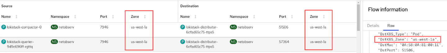
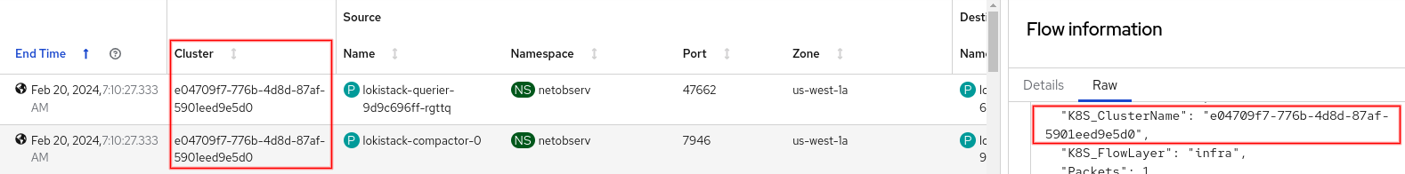
Figure 10: Availability Zone. Cluster ID: The cluster ID is the same value shown in the Home > Overview, Details section. See Figure 11.
- Column: Cluster
- Label:
K8S_ClusterName
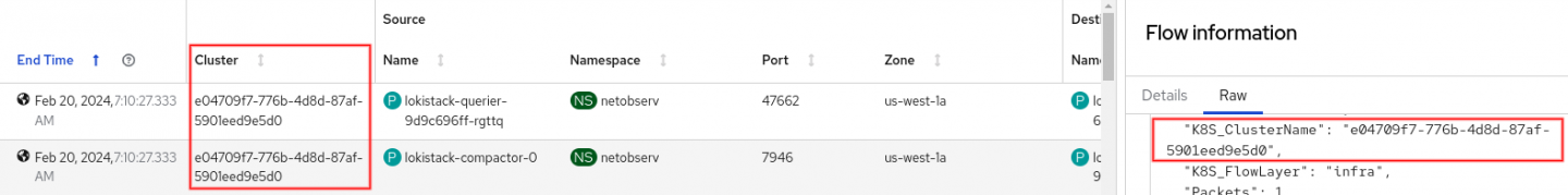
Figure 11: Cluster ID.
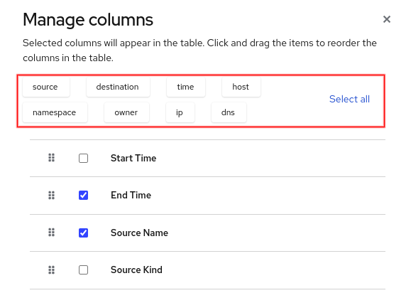
Manage columns selection
Like the Manage panels dialog, the Manage columns dialog, found under Show advanced options, also provides a simple filter (Figure 12). Click one or more buttons to filter on the selection.
Topology tab
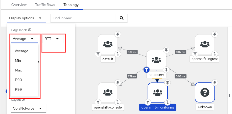
Topology supports the same data in the Overview graphs for its edge labels, such as P90 (90th percentile) and P99 (99th percentile). See Figure 13.
Filter
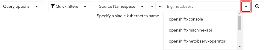
At the top of the screen is the filter used by all three tabs. A drop-down button was added to show recently used entries and to do auto-completion (Figure 14).
FlowMetrics API
The FlowMetrics API allows you to take any combination of flow data labels and turn it into a Prometheus metric. In other words, you can create your own custom metric and then even create alerts and external notifications based on them. This is a development preview feature. Please be aware that generating too many metrics or not understanding how performance is impacted by querying these metrics can result in over utilization of resources and storage and cause instability.
To create a metric, go to Operators > Installed Operator and for the Network Observability row, click Flow Metric in the Provided APIs column (Figure 1). Click the Create FlowMetric button to begin.
Minimally, you need to provide a metric name and specify the type, although you will likely need to use filters and possibly labels. Prometheus provides some best practices on naming. Just remember that the actual Prometheus metric name is prefixed with netobserv_. There is also information on the various metric types. FlowMetrics only supports Counter and Histogram and not Gauge or Summary.
As an example, let's create a metric that reports the number of bytes coming externally to a namespace of our choosing. To achieve this, use a label for the destination namespace, which is called DstK8S_Namespace. The traffic will be considered external if the source name doesn't exist. Enter the following values in the Form view for FlowMetrics. Also, make sure you remove the pre-existing filters. Note that this is what you enter in the UI; it is not YAML.
metricName: ingress_external_bytes_total

type: Counter

direction: Ingress

filters:

  field: SrcK8S_Name

  matchType: Absence

  value: <blank>

labels:

  - DstK8S_Namespace
When you create this instance or make any changes to FlowMetrics, the flowlogs-pipeline pods will restart automatically. Now go to Observe > Metrics and enter netobserv_ingress_external_bytes_total (don't forget the prefix netobserv_). Because of the label, it separates out each destination namespace in its own graph line. Try out the other PromQL queries below:
Graph the number of bytes incoming on namespace
openshift-ingress. You can replace the Namespace value with any namespace.netobserv_ingress_external_bytes_total{DstK8S_Namespace="openshift-ingress"}In some cases like
openshift-dns, you might get more than one graph line because it's running on multiple pods. Usesumto combine them into one graph line.sum(netobserv_ingress_external_bytes_total{DstK8S_Namespace="openshift-dns"})Graph the average rate over a 5-minute interval.
sum(rate(netobserv_ingress_external_bytes_total{DstK8S_Namespace="openshift-ingress"}[5m]))
Summary
This release should make it easier to install Network Observability. The graphs in the Overview tab provide many options on how you want to view the traffic. The cluster ID makes Network Observability multi-cluster aware. The availability zones give you geo-location information. Being able to create your own custom metrics is a promising step towards detecting issues.
Give this release a try, and let us know what you think! You can always reach the NetObserv team on this discussion board.
Last updated: September 27, 2024