The most recent release of Red Hat OpenShift Container Platform provides enhancements and features that make application development even easier. These enhancements include:
- An enhanced Developer Catalog.
- Operator-backed services in the Developer Catalog.
- The GA release of Helm 3.
- An add context option in the Topology view.
Keep reading to learn more about each of these enhancements in more detail.
Developer Catalog updates
The enhancements to the Developer Catalog include options to allow developers to filter and group items more easily, and labels to help visually identify the difference between catalog items. These enhancements are aimed at making it easier and faster for developers to find the items they’re looking for, such as filtering the Developer Catalog, grouping the Developer Catalog by Operator, and type badges.
Filtering the Developer Catalog
The filtering options in the Developer Catalog have been updated to include the ability to filter by Type, such as Operator Backed, Helm Charts, Builder Image, Template, and Service Class, as shown in Figure 1.
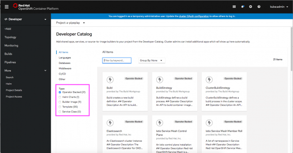
By default, Operator-backed items are selected, but developers can easily change the selections to see the types of items they need.
Grouping the Developer Catalog by Operator
When viewing Operator-backed items in the Developer Catalog, you can use the Group By dropdown menu to group items by the Operator that they are associated with, as shown in Figure 2.
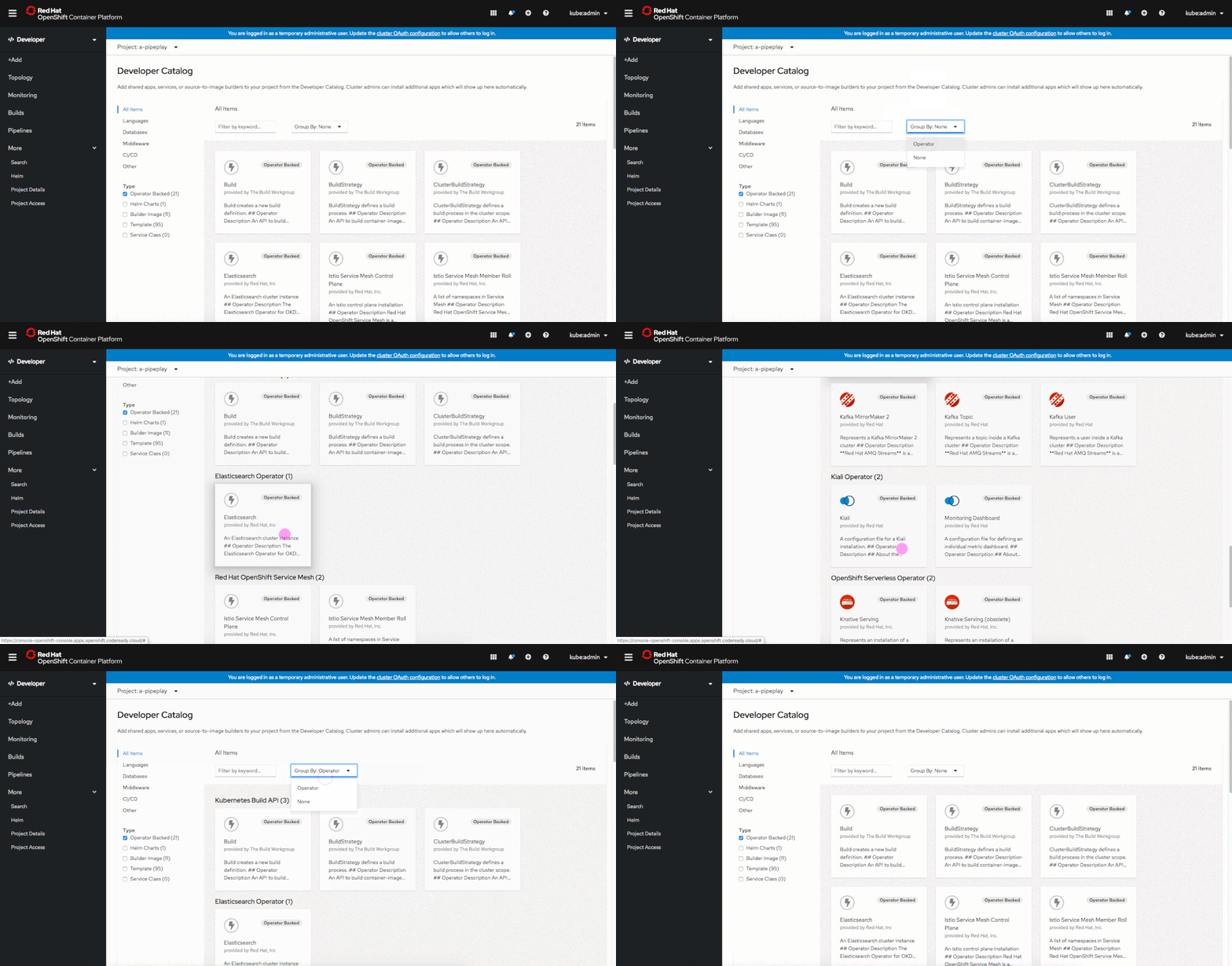
This grouping feature can be useful when an Operator consists of multiple items in the catalog.
Type badges help to visually differentiate offerings
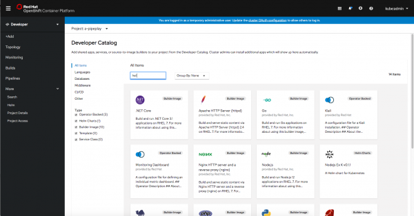
To make it easier for developers to scan the Developer Catalog items, the card for each item now contains a label in the top-right corner to indicate the type of the item. For example, in Figure 3, if the user searches for Node and wants to find the Node.js builder image, the labels make it easier to quickly identify the right item.
Operator-backed services in the Developer Catalog
Operator-backed services in the Developer Catalog allow developers to run a variety of workloads that are installed and managed by a Kubernetes Operator. In the Developer Catalog, it’s easy to select and deploy a variety of Operator-backed services.
Creating Operator-backed services
In the +Add navigation section, then select From Catalog to create an Operator-backed service. By default, the Developer Catalog is filtered to display Operator Backed services. Select the one you want to install. You’ll be brought to the YAML editor, but have no fear, you can click on the Edit Form link to follow a guided installation process, as shown in Figure 4.

Operator-backed services in Topology view
Operator-backed services are visually distinct in Topology view, and the associated resources are grouped together, as shown in Figure 5.

By clicking on the Managed by: link, you can access the resource that manages the resources that are part of the Operator-backed service, as shown in Figure 6.
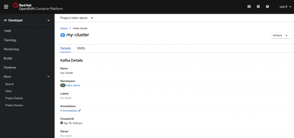
If you prefer a more streamlined layout in Topology view, you can collapse the information about the Operator-backed services by deselecting the checkbox next to Operator Groupings in the Display dropdown menu, as shown in Figure 7.

Helm 3
Helm 3 is GA in this release of OpenShift. Developers can now install Helm charts through the Helm CLI as well as the Developer Catalog. Information about Helm releases is displayed in the Developer Perspective.
Helm is a package manager for Kubernetes applications, and it helps define, install, and update apps. Helm uses a packaging format called charts. A Helm Chart is an application package that contains templates for a set of resources (such as a Deployment or Service) that are necessary to run the application. A template uses variables that are substituted with values when the manifest is created. The chart includes a values file that describes how to configure the resources.
With the release of OpenShift 4.4, Helm 3.1 reaches GA. This means that you can find Helm Charts in the Developer Catalog, where developers have the ability to specify custom values.yaml during chart installation, along with Helm releases in both the Helm and Topology navigation sections.
Installing the Helm 3 CLI
The Helm 3 CLI is available to download from the OpenShift web console by clicking Command Line Tools under the Help menu, as shown in Figure 8.

With the Helm 3 CLI, developers can create and install charts, add repositories to their own local Helm client, and more. You can learn more about the installation and usage of the Helm 3 CLI in the documentation.
Installing a Helm Chart in OpenShift
There are two ways to install Helm charts on OpenShift: using the Helm CLI or from the Developer Catalog.
The Developer Catalog now includes Helm charts from a curated repository, as shown in Figure 9, allowing the developer to install a chart by customizing the values.yaml. In a future release of OpenShift, the repository in the Developer Catalog will be configurable.

To install a Helm chart from the Developer Catalog, filter the catalog items by Type and select Helm Charts. When you click a chart to install, you have the opportunity to customize the information in the values.yaml file, as shown in Figure 10.

Helm Releases in the Developer Perspective
Information about Helm releases can be found in two places in the Developer Perspective. In Topology view, Helm releases are visible and denoted with the Helm icon, as shown in Figure 11.

Helm releases are also accessible in list format from the left navigation under More -> Helm, as shown in Figure 12.

Add Context from the Topology view
Developers can now right-click on the canvas in Topology view to add new resources to applications and projects. When adding items in context, the appropriate service binding is created on the fly, saving the developer time.
Visually laying out the application structure allows developers to make quick decisions and determine better directions. The ability to quickly access the components from the catalog and link them in their application structure in fewer steps can reduce the time and effort required to enhance or extend an application. To enable this feature, the Topology view now allows developers to add a new resource directly to an application or project from the canvas or to create a relevant contextual binding with an existing component seamlessly.
Accessing the "Add-in-context" trigger
There are two ways to access the Add-in-context trigger: the right-click menu option, and the connector handle.
Using the right-click menu option
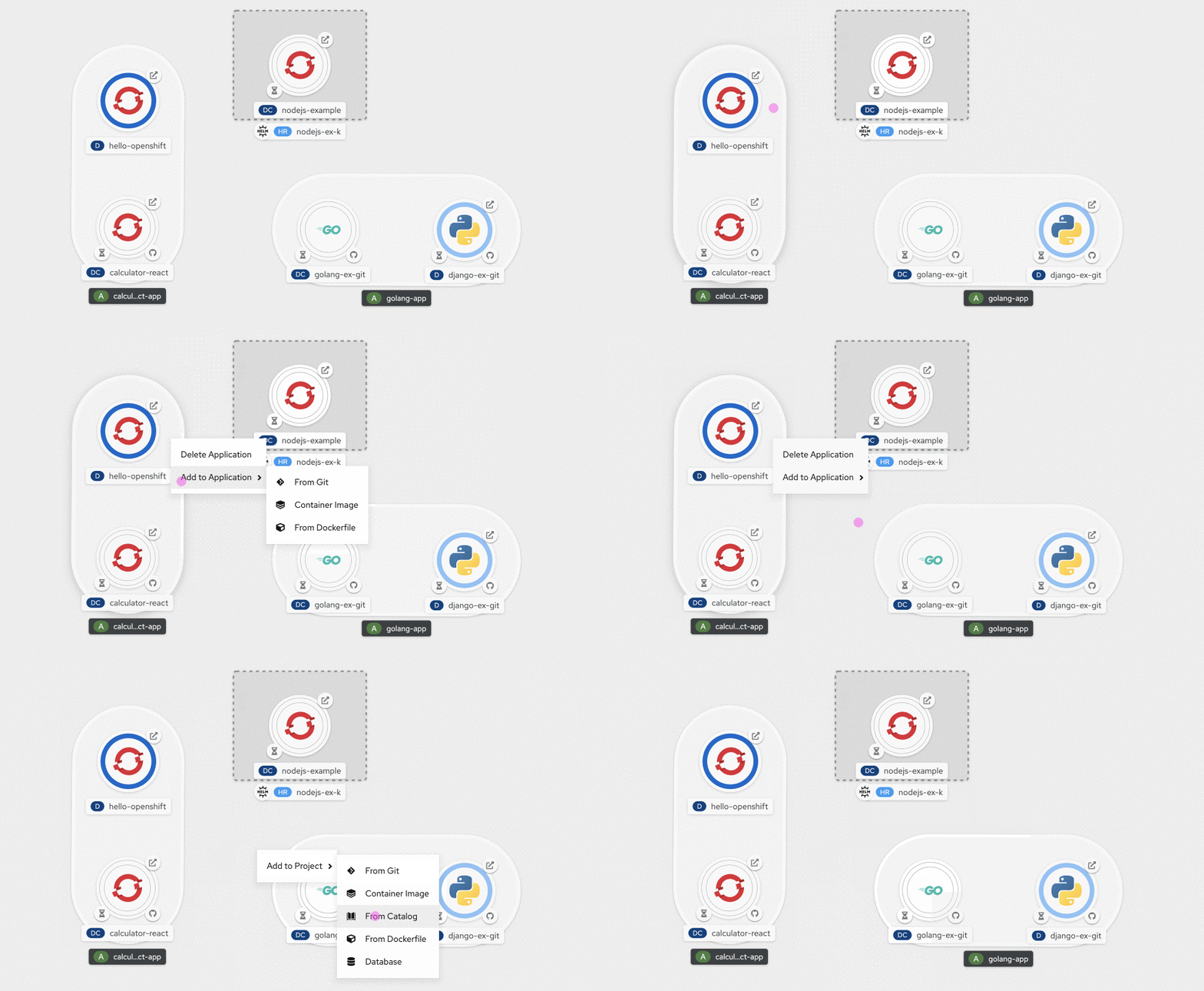
Performing a right-click anywhere on the canvas displays the contextual actions menu specific to the area that was clicked, as shown in Figure 13. For example, the contextual menu for an application would provide options to add resources to that application, while the contextual menu invoked from the unassigned area on the canvas would display the options to add resources to the project.
Using the connector handle
On hover, a connector handle extends out of every component. Dragging the arrowhead of the connector handle over any part of the topology graph, except component nodes, morphs it into an "add" symbol, as shown in Figure 14.
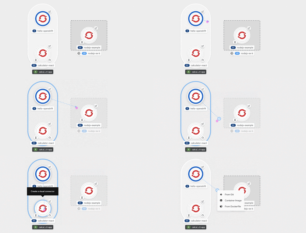
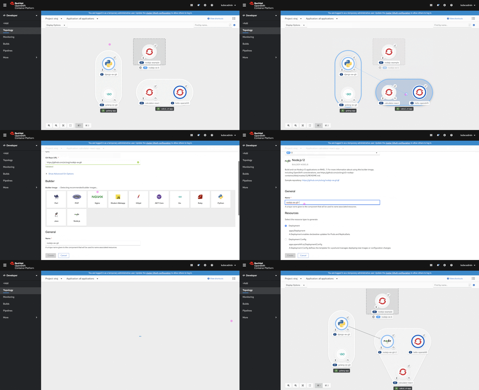
Dropping the cursor over any desired area on the graph invokes a context-specific menu of options to add a resource. Selecting any of those menu options, directs the user to the respective add form, with the context (application and labels) pre-assigned.
Once the action is confirmed, the developer is taken back to the Topology view where they see the newly created component and its associated binding connector, as shown in Figure 15. This single interaction increases efficiency by replacing three actions—creating a resource, assigning an application label to it, and creating a connector to the relevant resource.
We hope these new features and enhancements will improve your ability to create and deploy applications on OpenShift. In future releases, we plan to provide guided flows by default and decrease the need to edit YAML files.
Ready to get started?
Provide your feedback!
Share feedback or ideas for application creation and deployment here. Also, join our OpenShift Developer Experience Google Group to participate in discussions and learn about our Office Hours session where you can collaborate with us and provide feedback.
Learn more
If you’re interested in learning more about application development with OpenShift, learn more from Application development on OpenShift.
Last updated: February 26, 2024