With the rise of social networks and people having more free time due to isolation, it has become popular to see lots of maps and graphs. These are made using big spatial data to explain how COVID-19 is expanding, why it is faster in some countries, and how we can stop it.
Some of these maps and graphs are made by inexperienced amateurs that have access to huge amounts of raw and processed big spatial data. But most of them are not sure how to handle that data. A few unaware amateurs mix different sources without caring about homogenizing the data first. Some others mix old data with new. And finally, most forget to add relevant variables because this is too much data to handle manually.
How would a professional handle all of this?
The cholera outbreak
In situations where we have to handle big spatial data, I can't help but wonder: What would John Snow do? I'm not talking about that warrior in the cold north fighting zombies. I'm talking about the original John Snow, an English doctor from the XIX century that used spatial data to study a cholera outbreak.
Let's go back to 1854, London, where a cholera outbreak was taking heavy casualties. Most doctors at the time, unaware of germs, thought it was caused by miasma, a kind of bad air that polluted people, making them ill.
John Snow data analysis
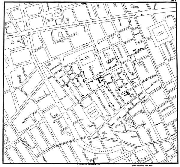
But John was not convinced by that theory. He had a hypothesis on what the real cause could be, suspecting water-related issues. He collected data on where the people infected lived and where they got their water from and ran some spatial data analysis to prove those ideas. Figure 1 shows one of his original maps.

With that accurate data, he was able to generate a cluster map showing the spread of the disease. This work helped him prove his theories on cholera's water origin. He had only a few sources of data, but they were all homogeneous. Plus, he was able to collect data directly in the field, making sure it was accurate and met his needs.
It's important to notice that because he used the right data, he arrived at the right conclusions. He studied the outliers, like those people drinking water from a different source than what should have been the closest to their homes. Thus he was able to conflate the data with the proper sources, curating it. Homogenizing and conflating the sources of data is a relevant step to arrive at the right conclusions.
John Snow had to manually conflate and analyze all of the data and it was a good choice. The amount of data he handled was fit for working with pen and paper. But in our case, when we try to conflate all the sources available worldwide, what we are really facing is big spatial data, which is impossible to handle manually.
Big spatial data
Not only do we have the specific related data, but we also have data about different isolation or social distancing norms, health care, personal savings, access to clean water, diet, population density, population age, and previous health care issues. The amount of related data available is huge.
Remember, if your data fits into a hard disk, that's hardly big data. We are talking here about the amount of data that calls for unending data storage on server farms. No analyst can update, conflate, and analyze all that data manually. We need tools, good tools, to be able to deliver reliable results.
Consider that different data collectors update their data in almost real-time but at different rates, and each country has its own statistics and its own way to measure each variable. So, you need to transform and homogenize before conflating those sources.
How can we keep up-to-date without going crazy? Before you can finish even half of the workflow shown in Figure 2, there's freshly new data waiting for you.

What would John Snow do? Well, I'm quite sure he would like all of us to use the proper tools for the work. That's why it's called Location Intelligence.
Middleware to the rescue
Regarding those four steps, there are three that can be automated: update, homogenize, and conflate. All of those are tedious and repetitive tasks that make developers quickly jump into scripting rough code. And we know what happens when we write quickly supporting code: We tend to make the same mistakes that others already fixed.
Well, here we are lucky. We have several free and open source software libraries and frameworks that can help us through these tasks. These tools can be found in the Red Hat Fuse Integration Platform.
Apache Camel
Our first option should always be using Apache Camel to help us create complex data workflows. With this framework, we can periodically extract the latest data from different sources, transform, and conflate automatically. We can even use Camel K and leave it running on some Kubernetes container while we focus on the non-automatable steps of our work.
Defining workflows in Camel is easy. You can use different common languages such as Java, Javascript, Groovy, or a specific domain-specific language (DSL). With Camel's hundreds of components, you can feed your workflow with almost any source of data, process the data, and output the processed data in the format your analysis requires.
Syndesis
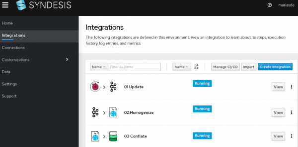
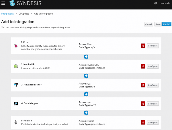
For those data analysts that are less tech-savvy and feel that writing Camel scripts is too complex, we also have Syndesis. With Syndesis you can define data workflows in a more visual way, as you can see in Figure 3.

This means you can update that big spatial data without having to write a single line of code. Or, maybe you just want to speed up the workflow creation process to jump directly into the analysis.
We can either create one single workflow or break it down to several workflows, as shown in Figure 4. For example, the first process could be triggered by a timer to download different data sources and send that raw data to a Kafka broker. Then, a second process could listen to that broker, transform and homogenize the data previously downloaded, and store it on some common data storage. Finally, a third process can take several sources of data from that common storage with homogenized data, conflate those sources, and prepare the data for further analysis or exposition.

Note that each step can filter, transform, and use data from different sources, allowing us to create complex workflows in a simple and visual way. We can run the data through different APIs, XSLT transformations, data mapping, and filters to make sure we end up with data ready for analysis.
The final touch
Now that we have our data updated, homogenized, transformed, and conflated, we can start the analysis. As both Camel and Syndesis can provide the output in different formats, we can connect it to any software we need to do this analysis. From databases like PostgreSQL to XML-based data formats like KML, we could feed our analysis tools the way we need.
For example, we can use QGIS, which is an advanced desktop application for data analysis. You can add all those already transformed and conflated big spatial data sources to QGIS to create beautiful graphs and maps as outputs. After that, you can publish your maps with OpenLayers or Leaflet.
Make John Snow proud! And do it using free and open source software.
Last updated: June 26, 2020