The Red Hat build of Keycloak Admin Console is based on the admin console of the single sign-on for Red Hat solutions, but it's redesign is easier to use and more accessible. You can do the same things as before, such as create client applications, manage users, and monitor sessions. But these actions are much easier to perform now.
This article describes six improvements to the Red Hat build of Keycloak Admin Console.
1. Improved organization
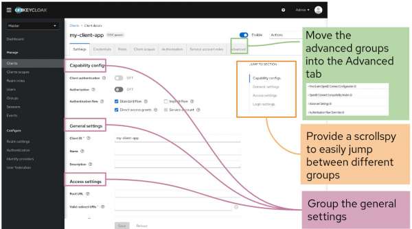
The old Admin Console had many pages with long lists of controls. You could easily miss the advanced features at the bottom. Now the general controls are grouped together, and the advanced functionality has its own tab (Figure 1).
2. Task flows use a consistent method
The old design used different approaches for similar operations, such as the interaction for saving a change. The new design uses consistent models for interaction. So you will already know how to save a change based on another feature (Figure 2).
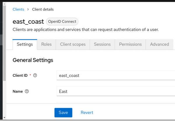
Also, the new console uses UI elements from PatternFly and matches the controls that Red Hat OpenShift users have already learned. This approach means you can focus on being productive instead of learning new UI paradigms.
3. Tool tips no longer block fields
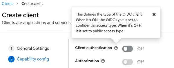
In the old console, hovering over a field caused tooltips to block fields you needed to set. In the new design, you will click a question mark to display tool tips (Figure 3). Even expert users find they cannot recall the meaning of every control, so the tool tips are important.
4. Fast access to information
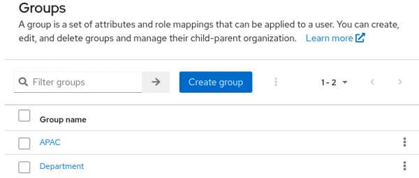
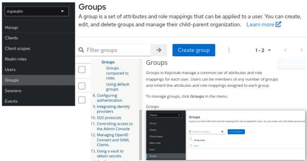
In the old Admin Console, you might need to search the entire doc set to find an answer to one question such as, “What is the difference between a role and a group?” In the new design, information appears on the screen before you ask (Figure 4).
5. Relevant documentation in one click
If you need more help, you can click the Learn More button to go to the related documentation topic. You don’t need to hunt for the right guide; just click the Learn More button (Figure 5).
6. Improved accessibility interface
The new console has major accessibility improvements to provide a better user experience for users with visual impairments and users who rely on screen readers, as follows:
- For users with color vision deficiencies or low vision, text elements now have clear contrast to background colors, meeting the WCAG 2 AA contrast ratio thresholds.
- For users who use screen readers, all input fields have accessible names and form elements, including labels. Also, images now have alternative text.
- For interactive controls, each focusable element now has an active and unique ID, eliminating confusion and aiding navigation.
Users approved the new design
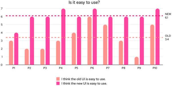
The new design has been tested and revised based on user feedback. After the final updates, novice and expert users found that the new Admin Console is easier to use than the old console for a sample set of tasks (Figure 6).
Try the new Red Hat build of Keycloak Admin Console
Check out the improved user experience and accessibility of the new Admin Console.
- Log on to the Red Hat customer portal to download Red Hat build of Keycloak and try the Getting Started Guide.
- Check out more Red Hat build of Keycloak articles at Red Hat Developer.
