I think of machine learning as tools and technologies that help us find meaning in data. In this article, we'll look at how understanding data helps us build better models.
This is the first article in a series that covers a simple life cycle of a machine learning project. In future articles, you'll learn how to build a machine learning model, implement hyperparameter tuning, and deploy a model as a REST service.
The importance of understanding data
Machine learning is all about data. No matter how advanced our algorithm is, if the data is not correct or not enough, our model will not be able to perform as desired.
Sometimes there is data that may not be useful for a given training problem. How do we make sure that the algorithm is using only the right set of information? What about fields that are not individually useful, but if we apply a function to a group of fields, the data becomes very useful?
The act of making your data useful for the algorithm is called feature engineering. Most of the time, a data scientist's job is to find the right set of data for a given problem.
Data analysis: The key to excellent machine learning models
Data analysis is the core of data science jobs. We try to explain a business scenario or solve a business problem using data.
Data analysis is also essential for building machine learning models. Before I create a machine learning model, I need to understand the context of the data. Analyzing vast amounts of company data and converting it into a useful result is extremely difficult, and there is no one answer for how to do it. Figuring out what data is meaningful, what data is vital for business, and how to bridge the gap between the two is fun to do.
In the following sections, I showcase several typical data analysis techniques that assist us in understanding our data. This overview is not complete in any respect, but I want to show that data analysis is the first step toward building a successful model.
The iris data set
The data set I am using for this article is the iris data set. This data set contains information about flowers from three species: setosa, virginica, and versicolor. The data includes 50 individual cases of each species. For each case, the data set provides four variables that we will use as features: petal length, petal width, sepal length, and sepal width. I picked this data set to experiment with because it is widely available with easy-to-understand features.
Our job is to predict the species of the flower through the feature set provided to us. Let's start with understanding data.
Note: The code referenced in this article is available on GitHub.
How do I start analyzing my data?
When I get a set of data, I first try to understand it by merely looking at it. I then go through the problem and try to determine what set of patterns would be helpful for the given situation.
A lot of the time, I need to collaborate with subject matter experts (SMEs) who have relevant domain knowledge. Say I am analyzing data for the coronavirus. I am no expert in the virology domain, so I should involve an SME who can provide insights about the data set, the relationships of features, and the quality of the data itself.
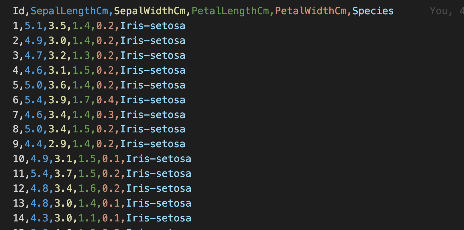
Looking at the iris data set details shown in Figure 1, I find that the data contains an Id field, four properties (SepalLengthCm, SepalWidthCm, PetalLengthCm, and PetalWidthCM), and a Species name. In this case, the Id field is not relevant to predicting the species; however, it's important to examine each field for every data set. For some data sets, this field may be useful.
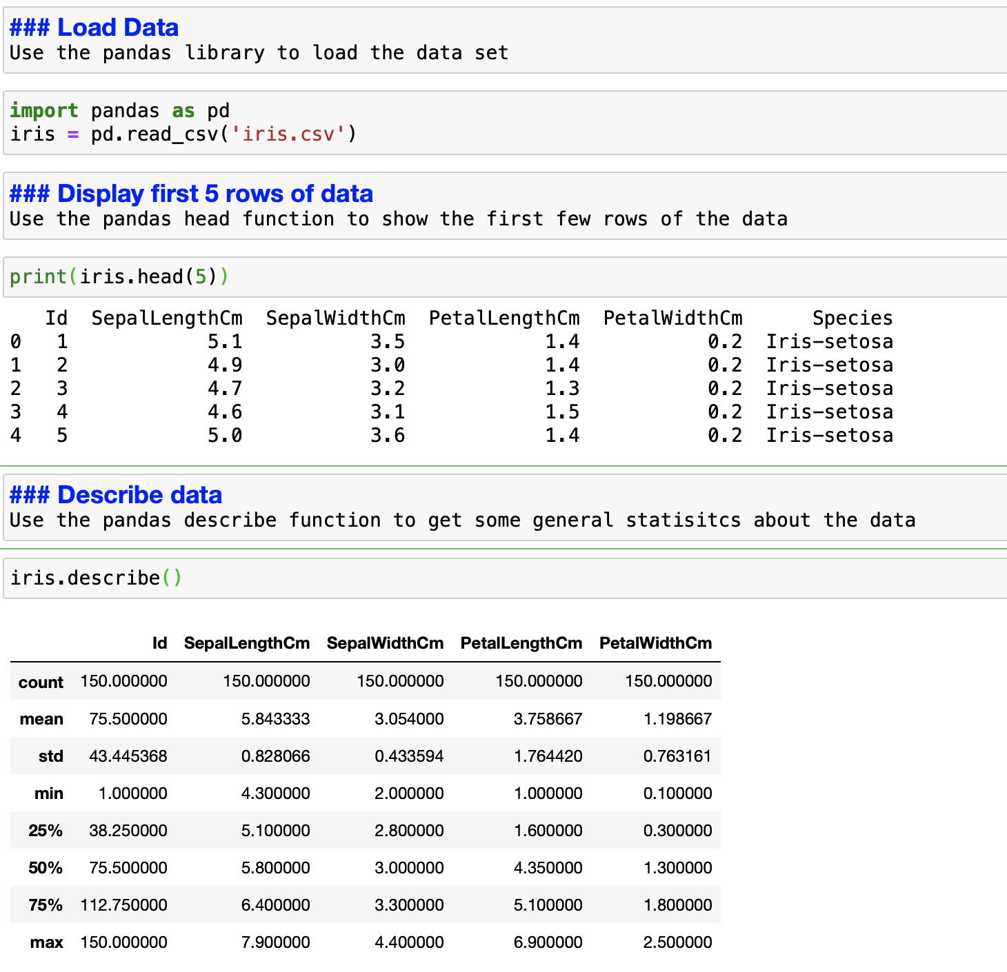
Okay, enough staring at the data set. It's time to load the data in my Jupyter notebook and start analyzing it. I use the pandas library to load the file and view the first five records (see Figure 2). Then I use the describe function to get a more detailed understanding of the data I am working with. The describe function provides the minimum value, maximum value, standard deviation, and other related data for the data set. This information gives you the first clue about the data you're working with. For example, if you are analyzing monthly billing data and you see the maximum value is $5,000, you will know that something is wrong with that dataset.
After looking at the data set, I find that the SepalLengthCm field is continuous; that is, it can be measured and broken down into smaller, meaningful parts. I am interested in seeing the data variation for this field, so let's look at how we can visualize this variable's statistics.
Box plots
A box plot is an excellent way to visualize and understand data variance. Box plots show results in quartiles, each containing 25% of the values in the data set; the values are plotted to show how the data is distributed. Figure 3 shows the box plot for the SepalLengthCm data.
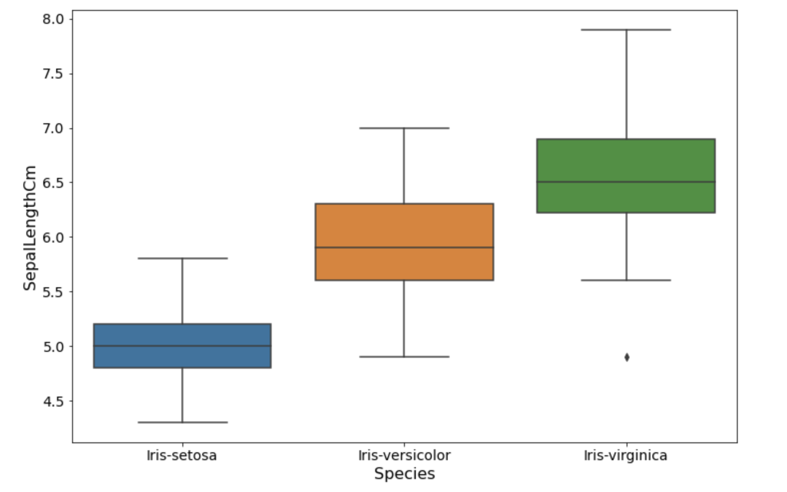
The first component of the box plot is the minimum value of the data set. Then there is the lower quartile, or the minimum 25% values. After that, we have the median value at 50% of the data set. Then we have the upper quartile, the maximum 25% value. At the top, we have the maximum value based on the range of the data set. Finally, we have the outliers. Outliers are the extreme data points—on either the high or low side—that could potentially impact the analysis.
What can we learn from the box plot in Figure 3? We can see that the SepalLength has a relationship with the iris species type. We can use this knowledge to build a better model for our given problem.
Now that I see the data variance, I would like to know about the data distribution in my data set. Enter histograms.
Histograms
A histogram represents the numerical data distribution. To create a histogram, you first split the range of values into intervals called bins. Once you've defined the number of bins to hold your data, the data is then put into predefined ranges in the appropriate bin.
Figure 4 shows our data as a histogram with five bins defined. The graph creates compartments for the SepalLengthCm data and groups the values in each bin.
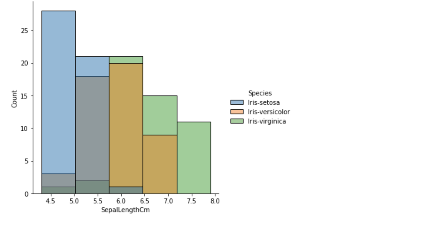
The preceding data provides the number of each species fit for each bucket or bin. You can see that the data is grouped into bins, and the number of bins is defined by the function parameter.
Density plots
The problem with histograms is that they are sensitive to bin margins and the number of bins. The distribution shape is affected by how the bins are defined. A histogram may be a better fit if your data contains more discrete values (such as ages or postcodes). Otherwise, an alternative is to use a density plot, which is a smoother version of a histogram. See Figure 5.
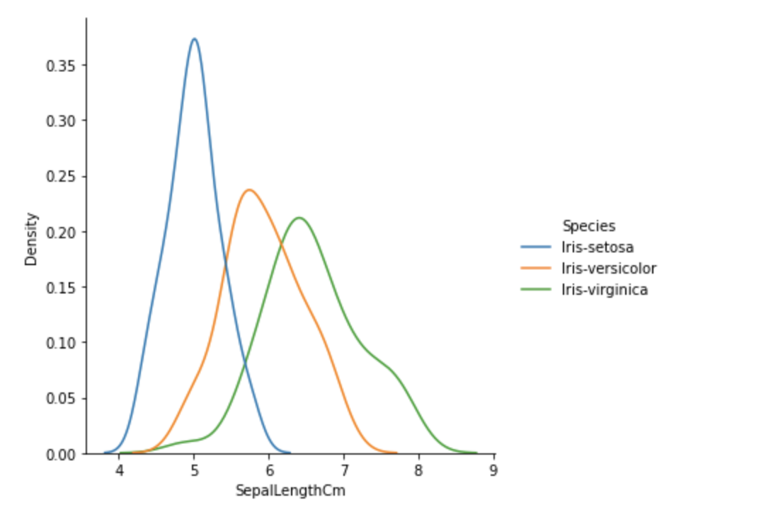
The density plot shown in Figure 5 helps us clearly visualize how the SepalLengthCm values are distributed. For example, based on this density plot, you can surmise there is a higher probability that the species will be setosa if the sepal length is less than or equal to 5cm.
Conclusion
In this article, you saw how to understand the data as part of the first step of your machine learning journey. In my opinion, this is the most critical part of building valuable models for your business.
Red Hat offers an end-to-end machine learning platform to help you be productive and effective in your data science work. Red Hat's platform brings standardization, automation, and improved resource management for your organization. It also makes your data science and data engineering teams self-sufficient, which improves the efficiency of your team. For more information, please visit Open Data Hub.
Last updated: February 5, 2024