For your end users, one of the most important aspects of your API is the perceived response time --- if your mobile application takes an excessive amount of time to load data, users will get frustrated.
In this series of blog posts, we’ll cover three ways to approach building a RESTful API that leads to better user experience by minimizing perceived response time. These strategies include: processing requests quickly, reducing payload sizes, and eliminating requests entirely, or only downloading data that has changed. And, we’ll show you how to do each by providing sample node.js code that can be deployed ‘as is’ on Red Hat Mobile Application Platform to build a better mobile API.
But, before getting into each strategy, why are these important? The user interface (UI) and user experience (UX) are extremely important to the success of mobile applications.
Effective UI and UX Design
Mobile has driven a revolution in software penetration. Today, almost 80% of US consumers own a smartphone capable of running complex software, or "apps" as we call them. These are “business to consumer” (B2C) solutions, and because they are customer-centric, often demonstrate excellent user interface and user experience design efforts.
Much of this design effort is focused on creating an eye-catching UI -- one that’s intuitive to use and reduces friction through a focus on UX. If friction exists, a user becomes frustrated with the application and is less likely to continue using it in the future. It is therefore essential that friction is minimised at all times.
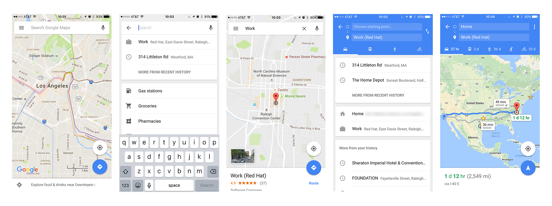
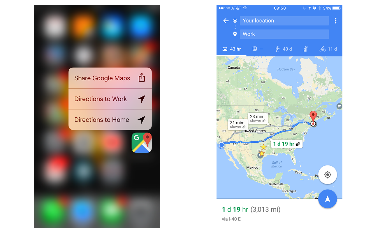
An excellent example of a frictionless interaction is seen in the iOS Google Maps application, and its use of Force Touch. By pressing hard on the application icon in iOS a user can easily get directions home or to work without lifting their finger. Normally this would require opening the application, entering the address (or selecting a suggestion such as “Work”), tapping “Route”, and choosing a starting location to reach the same point using Force Touch can bring you to immediately. This is demonstrated in the flow of screenshots below.
Without Force Touch users must go through multiple screens to confirm options
Using Force Touch, users can seamlessly get directions from their current location
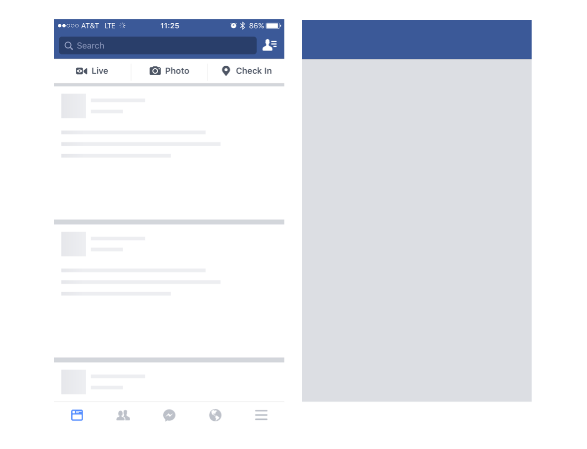
Besides reducing friction, another key feature to this UI/UX design is masking loading times associated with communicating with a mobile backend as this is commonplace in mobile applications. Let's take the Facebook application for iOS as an example of effective UI/UX design. It has three stages associated with its startup:
- Application startup: This is the screen (splashscreen) you see immediately after tapping the application icon. It resembles the basic application theme, but is devoid of information and fine detail.
- Application loaded: Empty UI components appear to simulate the News Feed. These panels look like the feed, but no actual data is being rendered yet since their HTTP API needs to return data.
- Application content loaded: UI components are now fully loaded since data has been loaded from Facebook HTTP API.
Facebook splashscreen and empty tiles used to mask loading phases from disk and mobile API servers, respectively
All technology users now, including B2B users, have become accustomed to fast response times and smooth user experiences due to the recent proliferation of mobile software, so much so that research shows that if a user experiences a 10-second load time they are likely to close your application. Now you can see why the Facebook application and other mobile applications use these techniques to minimise the perceived loading times associated with each phase of application startup. Each of these phases is masking some loading time associated with the application startup; first the application data being loaded from the iOS device storage is masked using a splashscreen, then the data loading from Facebook mobile servers is masked with empty UI components that resemble their complete counterparts.
UX and Mobile Resource Consumption
Developing applications for mobile landscape brings even greater UX considerations to the table. Unlike desktop applications, mobile applications work with significantly more limited resources. Your design decisions need to account for battery and bandwidth usage. Nobody likes when their phone battery is empty a mere 3 hours after a charge, and they especially dislike getting a bill from their mobile carrier for data overage charges.
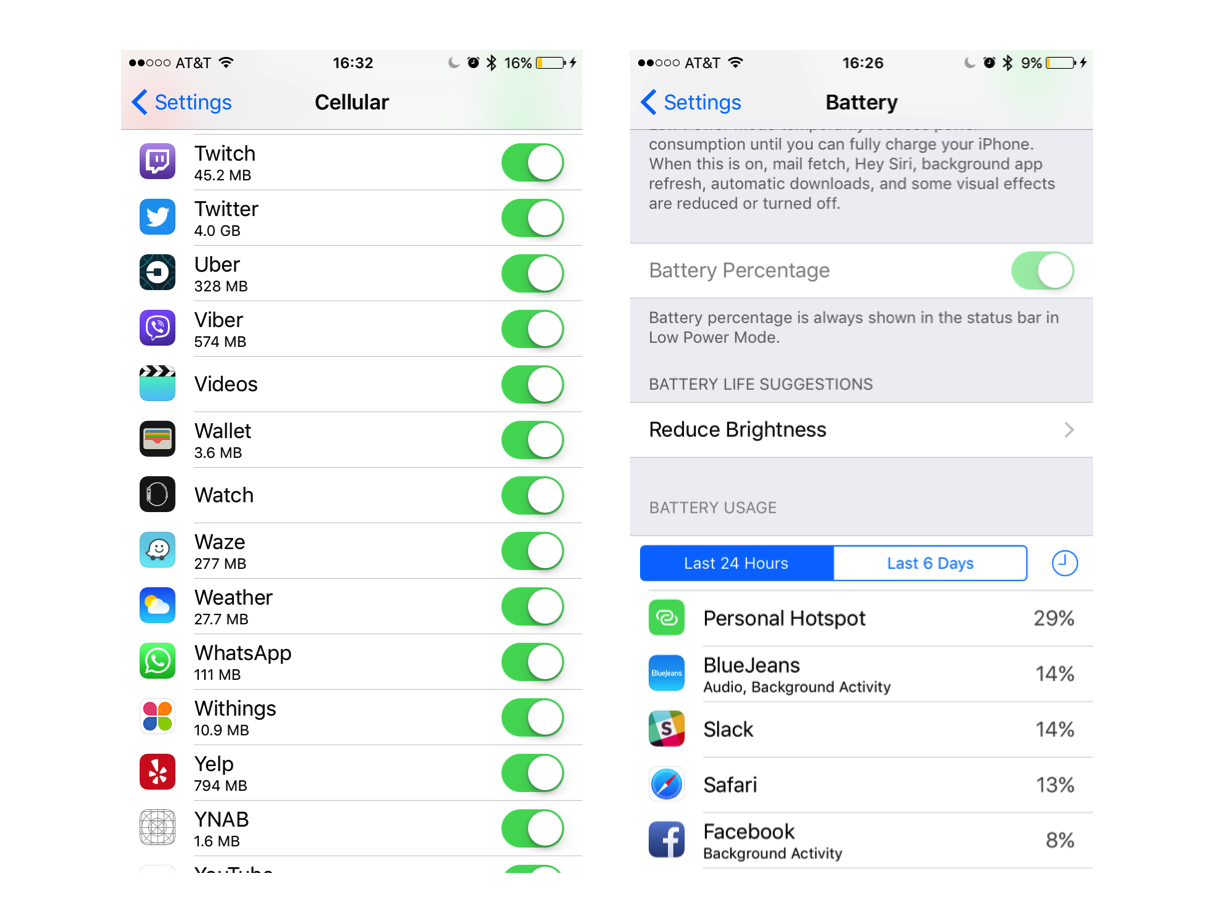
Today’s consumers expect your mobile application to meet their needs quickly and efficiently, and your internal B2B users are no exception. Tech-savvy users on most devices will even check if your application is misbehaving by taking advantage of the monitoring capabilities the device offers, and will promptly let you know about the problem, and possibly uninstall the application if the situation is dire enough.
Data and Battery usage monitors in iOS 10
Summary
As demonstrated, building your RESTful API is only half the story; mobile APIs need to load data quickly since UI and UX design can only mask loading times for so long before users grow tired of waiting. We also need to account for resource consumption concerns during mobile application development. Exposing a legacy API that is not mobile friendly will result in an inferior mobile experience, typically due to large, verbose payloads, e.g SOAP XML. Utilising an mBaaS such as Red Hat Mobile Application Platform is an excellent way to create a mobile friendly RESTful API that integrates with legacy systems and achieves the goals listed at the beginning of this article, without overhauling your existing systems.
In this blog series, I will cover techniques that can be leveraged to minimise request processing time, reduce payload size, and potentially eliminate unnecessary requests to your mobile API. Each section will contain snippets of node.js code that can be deployed as part of any application running on Red Hat Mobile Application Platform and will immediately improve user experience if used effectively.
Last updated: October 31, 2023


