Out of the box, Red Hat OpenShift provides a complete set of preconfigured monitoring dashboards. These standardized views are excellent for establishing a baseline of general cluster health and act as a necessary foundation for managing the platform.
However, in complex distributed systems, a "one-size-fits-all" approach to monitoring rarely suffices. The immediate, critical metrics needed by a site reliability engineer (SRE) managing storage capacity differ vastly from those required by a developer debugging microservice latency in a specific namespace.
We recognize that true observability requires context that static, prebaked views can't provide. Figure 1 highlights this transition as we cover our recent user experience (UX) design journey to help you move beyond default platform views. Learn how you can define the exact metrics that matter most to your workflow, directly within the OpenShift web console.
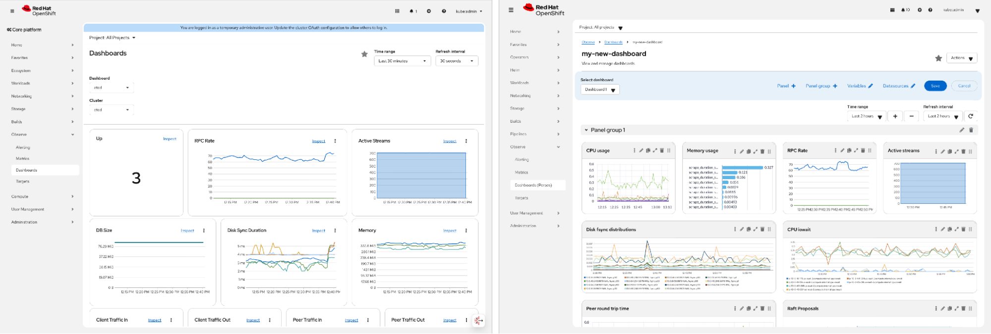
Red Hat build of Perses is a downstream version of the open source Perses project, functioning as a dashboarding tool designed specifically for displaying observability data. Shipped by the cluster observability operator, Red Hat build of Perses acts as a central hub that simplifies the OpenShift user journey by consolidating the installation, management, and visualization of observability components.
Defining the problem: The need for contextual visibility
To build a workspace that actually supports your active incident response, we first had to pinpoint exactly where standard dashboards fall short. Through user research and interviews, we identified three specific friction points interrupting the troubleshooting flow: jumping between external tools, fighting disconnected data silos, and struggling with views that aren't tailored to specific team roles.
The friction of context switching
Leaving your primary workspace has a real, cognitive cost. When key data isn't in the OpenShift console, you are forced to navigate to external tools like Grafana or third-party Software-as-a-Service (SaaS) platforms. This context switching breaks your mental model and forces you to manually reconstruct your system's state.
Information silos impede troubleshooting
Troubleshooting is fundamentally about correlation. To understand why a service is degrading, you often need to see unrelated metrics side-by-side, such as comparing storage Input/Output (I/O) with application latency.
However, in a static environment, these metrics are often scattered across different default tabs or pages. When users cannot view these disparate data points in a single pane, they struggle to connect the dots. We realized that for data to be useful, it must be visibly correlated, not just accessible.
Bridging the persona gap
Finally, we had to address the diverse needs of our audience. If you're a cluster admin (Ops), you need a high-level overview. Currently, that means aggregating metrics across the entire cluster to identify noisy neighbors or capacity bottlenecks, with research already underway to extend this capability to multicluster fleet views in the future.
Conversely, if you're a developer, you'll need a namespace-scoped magnifying glass to debug a specific microservice. Static, preconfigured dashboards often force a compromise between these two extremes. We needed a solution that could scale down to the namespace for the developer while scaling up to the cluster for the admin, without cluttering the interface for either.
The solution: Design principles for user empowerment
To solve these challenges, we didn't want to add more preconfigured charts. We needed to fundamentally change your relationship with the console. Our design approach focused on three core principles intended to empower you to actively curate insights.
Principle 1: Intuitive layout—drag, drop, correlate
The most immediate change is the shift to a drag-and-drop grid system. This isn't just a user interface (UI) convenience; it's the mechanism allowing the interface to adapt to your specific mental model of the system. If you're diagnosing a storage issue, you can now drag a persistent volume claim (PVC) capacity chart right next to an I/O latency graph. By giving you direct control over the spatial arrangement of these widgets, you can quickly organize information based on priority and logical correlation, rather than the arbitrary alphabetical or legacy ordering of static pages.
Principle 2: Visualization diversity for better data stories
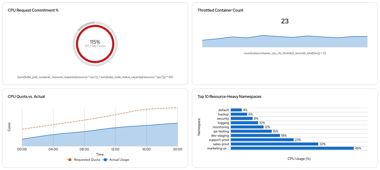
Different metrics require different visual vocabularies. A "healthy" cluster isn't just about numbers; it's about the story those numbers tell over time. To support this, we're using the eCharts library within the Perses engine, as shown in Figure 2. This provides a diverse set of visualization widgets designed to suit specific data narratives:
- Line and area charts: Ideal for spotting trends, spikes, and anomalies over time
- Single stats: For immediate, at-a-glance health checks (such as "Is the node up?")
- Gauges: For capacity planning, helping you visualize consumption against hard limits (like CPU quotas or memory limits)
Principle 3: PromQL power, UI simplicity
Perhaps most importantly, we operated on the belief that making dashboard creation accessible shouldn't mean "dumbing down" access to data. While the UI makes assembling a dashboard accessible, the engine runs on PromQL. To help advanced SREs and admins retain direct access to the full depth of the platform's metrics, we allow you to input raw PromQL queries directly into widget configurations. The design offers the ease of a visual editor without abstracting away the capabilities required for deep technical analysis.
Key design considerations: Fitting user workflows
As a UX designer, I know that a tool is only successful if it fits naturally into the daily routine of the person using it. We didn't want to build a feature that forces you to change your habits; we wanted one that respects your existing workflows. For this to be truly native to Red Hat OpenShift, the design had to align with two critical realities: the organizational structure of the teams and the engineering methodologies you adhere to.
Contextual scoping: Respecting roles
In a shared platform environment, relevance is everything. A major design challenge was managing noise by helping you see only what matters to you. We addressed this by scoping dashboards to mirror the natural separation of duties:
- Cluster dashboards (global scope): Designed for the cluster admin, these views provide a complete view of the specific cluster you are managing. They aggregate metrics across all nodes and namespaces within that cluster, allowing for deep infrastructure analysis. As we work toward those future fleet-wide capabilities, our current focus remains on mastering the experience for the single cluster.
- Project dashboards (namespace scope): For the developer, we tighten the focus. These views are scoped strictly to the application boundary, allowing teams to visualize microservice latency or error rates without wading through irrelevant cluster-level data.
Treating dashboards as code: The GitOps alignment
For our Red Hat audience, the most critical design decision was keeping these new views from being trapped in the UI. In the Kubernetes ecosystem, the source of truth is rarely a browser's local storage. It is a Git repository.
We designed this experience to adhere to GitOps principles. While the drag-and-drop UI lowers the barrier to entry, the output is pure, standard YAML. You can view, edit, and export these dashboard definitions code-first. This means you can version-control, review in a pull request, and deploy a custom dashboard designed in the console just like any other Kubernetes resource. We aren't just giving you a visualization tool; we're giving you an artifact that fits your continuous integration and continuous delivery (CI/CD) pipeline.
What's next
By letting you bring disparate metrics into a single layout, we're making the OpenShift web console an active workspace for troubleshooting rather than just a passive dashboard. This update empowers your teams, whether Ops or Dev, to define observability on their own terms, transforming the web console from a passive monitor into an active tool for investigation.
Start planning your view
Start auditing your current workflows. Ask yourself: Which metrics do I constantly struggle to correlate? Which browser tabs do I always have open alongside OpenShift to get the full picture? Those answers are the perfect candidates for your first customizable dashboard with Red Hat build of Perses.
We're excited to see the stories you build with your data.